

(click to enlarge)

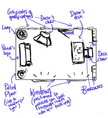
A revised set-design.

My finished storyboard.
This was certainly a challenging storyboard to make! Unlike anything else I've done, all of the action takes place in one small, concentrated area. I tried not to rely too heavily on my acting performance, and drew hand gestures that seemed relevant to the text, including the subtext behind it. As the dialogue is mostly Dr. Sobel's daydream, I didn't want to draw any focus away from him, which is why I've only used three different shots.

Lots of arm movement!
Below is my animatic. Spot the 'W' pose! Although this is seen as quite a clichéd, pantomime-like movement for performance animation, I believe it compliments the dialogue and would be appropriate for the frustration and disbelief my character is feeling.
The next step was character design...
Although the 'Morpheus' rig has excellent customisation capabilities, I couldn't quite find what I wanted from the pre-set features. To get around this, I took the original textures into Photoshop and spent a couple hours going back and forth into Maya, tweaking them until they looked right (I did not realise initially which areas of the texture would be stretched in order to wrap around the model's head).


I figured that as Dr. Ben Sobel is a tired, frustrated man with little interest in his job, it should definitely reflect in his appearance! I decided to make his skin tone quite washed out, implying that he doesn't get outdoors much, grey lines under his eyes to indicate tiredness, and a 5 o'clock shadow (painted with a 1px brush!) to portray lack of care in his appearance. I also painted over one of the eye textures to make them look grey and lifeless.

With Caroline, I wanted to create his opposite - tanned skin, bright, blue eyes and makeup -
implying care and thought in her appearance, not to mention youth. In
the film, Caroline is portrayed as a middle-aged woman, but I feel that
for the sake of my scene, the audience needs to relate to the main
character, and therefore feel resentment for Caroline. Although
blonde-hair-blue-eyes could be seen as a rather clichéd approach to a young, perhaps
materialistic, woman who moans about her failing love life, it will at
least provide an interesting, contrasting aesthetic to the scene.
No comments:
Post a Comment